

Websites for restaurants: get found at the moment someone is hungry
The decision about where to eat tonight happens on a phone and takes less than a minute. We build the page that wins that minute: a readable menu, correct opening hours, a table booked.
What you get
- A menu as a page, not as a PDF
- Opening hours and holidays maintained in one place
- Reservation or a call one tap away
- Visible for "restaurant near me" searches
- Photos that show your food the way it arrives
- Hosting, updates and ongoing care
- Built for
- Restaurants, cafés, bars, takeaway
- First question
- What is on, and are you open?
- Changes
- New menu by WhatsApp, usually the same day
- Timeline
- A few days to a few weeks, depending on budget and scope
Brands that trust us





The decision takes thirty seconds, on the move
Nobody researches a restaurant. Someone stands at a tram stop at half past six, types "food near me" into their phone and looks at three results. Whatever is not answered in those seconds does not get asked about, it gets swiped away.
Exactly three things have to be answered, in this order: are you open now. What is there to eat and roughly what does it cost. Can I get a table. Everything else, the history of the house, the team, the philosophy, matters for the brand and is irrelevant to that one minute. It belongs on the site, just not in front of those three.
So we build restaurant sites from the bottom up: the three answers first, then everything that makes people want to come back.
Your menu as a PDF is a closed door
The PDF is the most common and most expensive mistake in restaurant websites. It loads slowly, opens on a phone in a foreign app, is laid out for paper and needs three pinches to read. And to Google it is close to invisible: someone searching for "vegan bowl Zürich" does not find you, because your bowl sits inside a document instead of on a page.
Dishes as text
Every dish sits on the page as readable text, with its price. Google can find it and your guest can skim it.
Allergens and labelling
Vegetarian, vegan, gluten free, lactose free as filters rather than a footnote on the last line.
A lunch menu that changes
The weekly menu is the reason regulars visit the site twice at all. Changing it has to take two minutes.
Findable dish by dish
A menu as a page ranks for the words on it. A PDF ranks for nothing.
Opening hours are the most important text on your site
And the one most often wrong. The website shows last summer’s hours, the Google profile shows a different set, and Instagram has a Tuesday story saying you are closed for the holidays. In the end the guest trusts none of the three and goes somewhere else.
That is not a copy problem, it is a process problem. We maintain the hours in one place, hand them to Google in a structured form and build the exceptions in from the start: public holidays, annual closures, the rest day, the kitchen that shuts before the bar. When something changes you send us a message, or you change it yourself, whichever you prefer.
Food sells on the picture, not on the description
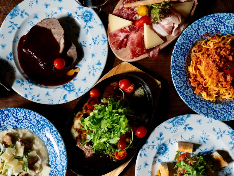
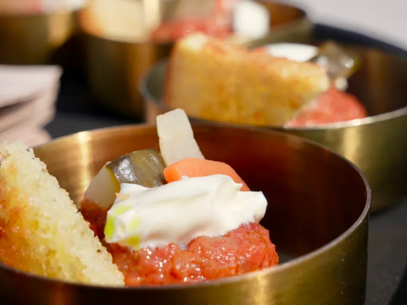
No adjective beats a good photo of the plate. And nothing damages a restaurant online as reliably as four dark phone shots from the one evening there was time.
We came from content production before we built websites, and the photos on this page are from our own shoots. That gives you two routes: we come by and photograph the menu through, or we take your existing pictures and lift them with our AI workflow to a level that works online. Both are an option alongside the website rather than part of it, and we tell you in advance which route is worth it for your menu.
Booking a table without anyone phoning
Some of your guests are happy to phone, others never phone and would rather book at eleven at night. Both should end up at a table, so both belong on the page: the number as a tappable link, so a call is one tap, and a booking option for everyone else.
Which version is right depends on your operation. An existing reservation system we integrate. Where there is none and none is needed, a short form is often enough, landing in the right inbox and asking what you would ask anyway: how many people, when, allergies, a high chair. Anyone who sees a confirmation after sending does not phone again just to be sure.
Does this sound like your project?
One short conversation is enough for us to tell you what is realistic inside your budget.
The site is where the hunger lands
You are usually seen somewhere else: on Instagram, in a reel, on a plate in the feed of someone who ate with you. The website is where being seen turns into a booking. We do both, images and social media from day one, websites since our clients noticed that reach without somewhere to land does not do much.
Website & SEO
Website, SEO, hosting and ongoing care in one place. Built so your web presence gets found and brings enquiries.
Learn moreAI Product Photos
Phone photos become product images for your website, shop, ads and social media, delivered fast with full usage rights.
Learn moreSocial Media Marketing
Social media strategy and content that build reach and send relevant visitors to your website.
Learn moreFood brands that trust us
Genusstour walks guests through restaurants and lives on a dish looking as good in the picture as it does on the table. MomoTime sells momos and a room worth seeing. For both we did images, content and social media, not a website. The website mechanic is Therapy Medhi: a page that turns a search into an appointment, which is exactly what should turn a search into a booking for you. Each card says which work it was.
Genusstour
For almost ten years Genusstour has run culinary experiences in Switzerland and abroad. Our goal was to capture the atmosphere in photos and video, and win new guests with it.
Services used
Content Production
MomoTime
MomoTime is a Swiss maker of handmade momos, inspired by Tibetan tradition and refined with local ingredients. The goal was to sharpen the visual presence and strengthen the brand online with high-quality photo and video content.
Services used
Content Production · AI Content Production · Social Media Branding · Social Media Marketing
Therapy Medhi
After more than 20 years as a medical massage therapist, Medhi opened his own practice at Paradeplatz in Zürich. We support the new location with a trilingual website, SEO and Google Ads so the practice can build visibility and attract new patients quickly.
Services used
Website & SEO · Digital Advertising
Common questions
Often not for the first contact, but yes for the decision. Maps says you exist, Instagram says it looks good. What both lack is the full menu with prices, a reliable answer about holidays and a route to a booking that does not run through a direct message. On top of that, Google pulls the details for your Maps profile from your site too. Without one, the source that confirms everything is missing.
Yes, if you want to. Plenty of places would rather not, because at eleven at night nobody feels like logging in. So there is another way: you send the new menu on WhatsApp, the same way you would send it to the printer, and we usually have it live the same day. Which of the two you use is your call, and neither costs extra.
Not always. A system costs a monthly fee and pays off when you have many tables, several sittings and staff who would otherwise just work the phone. With twelve tables a form plus a tappable phone number is usually enough, and the money is better spent on photography. We tell you what we would do at your size, even when that is the smaller invoice.
They can stay, they bring you orders from people who do not know you. On your own site the direct route still belongs up front, because no commission comes off it. In practice: your own ordering or collection visible first, the platforms below as an additional option rather than the only one.
Ready to become more visible online?
Tell us where you are now. We will show you which mix of social media, website, SEO, content and automations makes sense.